Primal Radiance (Rebranding Gillette Nutrition)
Web design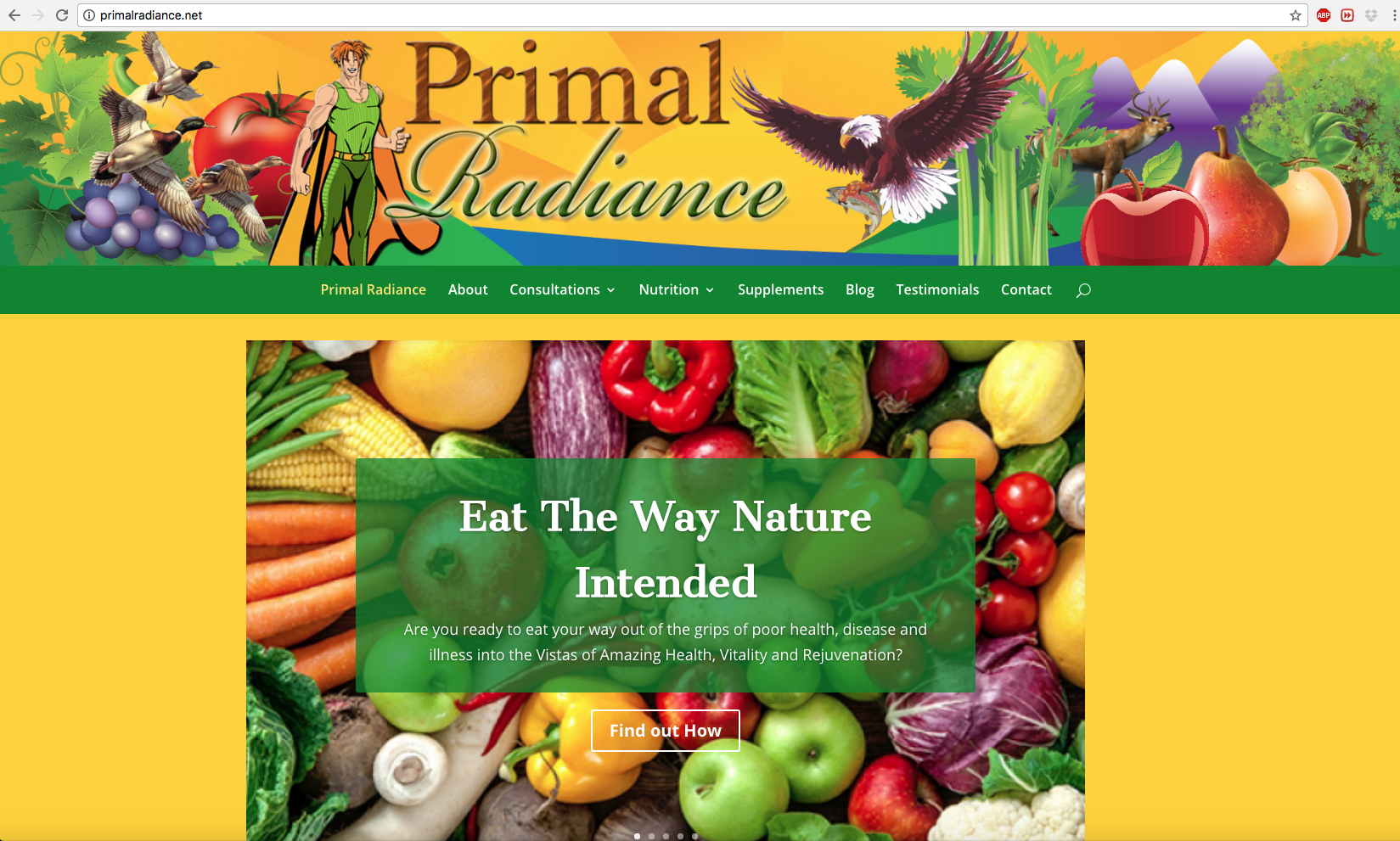
Project Description
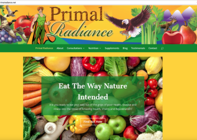
I created Greg Gillette’s webpage for Gillette Nutrition several years ago, starting out in plain html and css, then moving into WordPress, and Greg felt that his nutrition business had evolved beyond just nutrition, involving lifestyle, meditation practices, and more, and he approached me about rebranding his website for his new business name, Primal Radiance. Since his is a raw food approach mainly, he wanted the site to be primal, to match his new vision, for giving people the primal radiance, getting back to their roots, and living fully.
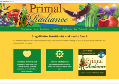
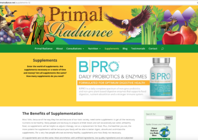
Keeping it simple, he didn’t want to change his logo overmuch, just the words, but wanted the site to be quite different–more colorful, more dynamic, and we chose a color palette that was both vibrant and earthy. The first step was designing a rich masthead full of imagery of raw foods, animals in nature, to evoke living primal. He wanted especially to plug his new radio show, as well as have social media links somewhere above the fold on his page, so I created a custom sidebar, which also would give access to the shopping cart.
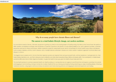
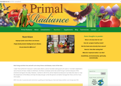
His original site had become very text laden, and I chose to break it up into manageable sections, interjecting more photography, and large swaths of background color to delineate sections, as that has become more popular in web design lately. The overall look and feel of the new site was totally new, rejuvenated, and Greg was ecstatic about how it turned out.
Project Details
Client Greg Gillette
Date November 2017
Skills Web design, CSS, HTML, Copy editing, Divi theme, WordPress
View Site http://primalradiance.net/
Project Gallery
Click the images below to see larger
