The Earring Shack
Branding, Print DesignProject Description
Mary Novak was helping her daughter-in-law with her new business, the Earring Shack, and while they were already making and selling jewelry, they needed a logo, preferably simple, based mostly on text, perhaps using a rustic, simplified shack image. She wanted something quirky, but which would not detract from the colorful earrings, so she preferred a vector, black & white image.
This logo came together one of the quickest I ever did, after an initial proof with several ideas, and Mary thinking it needed something more, maybe a palm tree…I had this flash of inspiration to bring the E and the G on the end around the Shack, surrounding it a bit. But then, seeing how much the G looked like an ear, if only it were reversed, I flipped it, and added a few shapes to make it look a little more like a G, as well as like an ear. The final touch was to hang an earring on it.
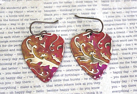
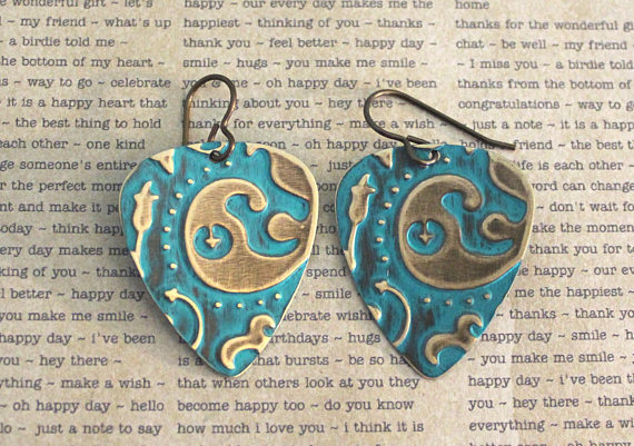
I can hardly wait to add images of the logo in use with the jewelry, but for now I’ll add a couple of samples of jewelry with which this logo would be paired.
Project Details
Client Mary Novak
Tasks Logo Design
Project Gallery
Click the images below to see larger
Earing-Shack-logo
The Earring Shack Logo
BrassGuitar
Sample Earrings
guitarearrings
Sample Earrings